
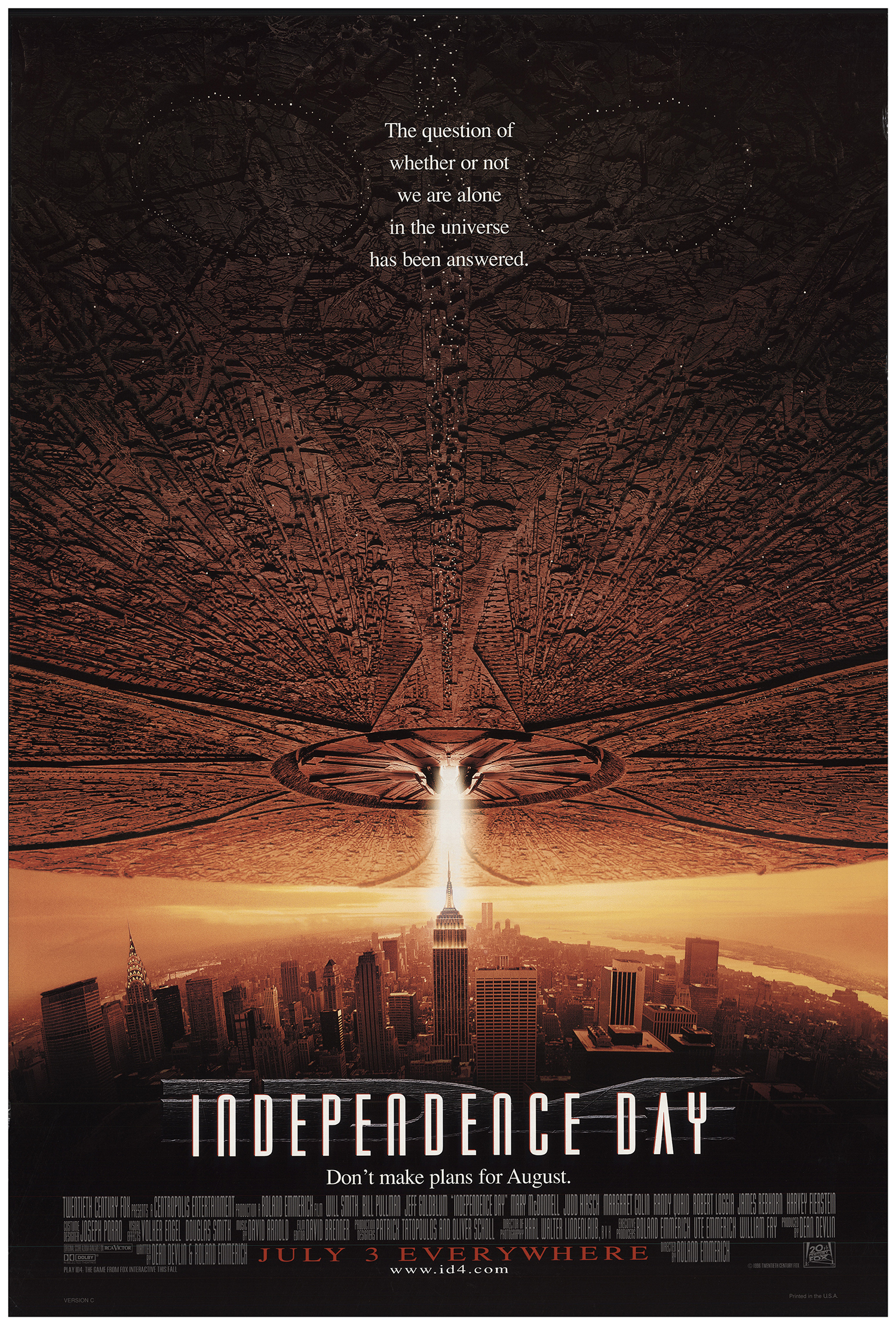
This is the original theatrical release poster for the movie ‘Independence Day’ also known as ID4. (IMDb link here.) I personally truly love this movie, and I love this poster even more. This poster was released in 1996 for the original showings of the movie.
One of the best things about this poster, besides the enthralling image, is its use typography. Both the phrases and the fonts used really add to the design in a meaningful way.
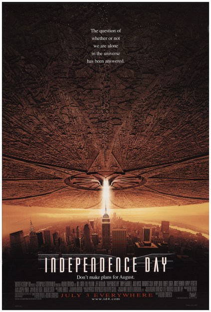
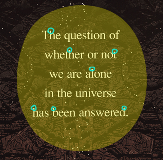
Here we can see the use of a oldstyle font, identified by its slanted serifs and variation in line weight. Serifs are the little marks at the ends of each letter, you can see them in the graphic below.
I love oldstyle fonts, and this one here works well because of its simplicity against the complex picture and the contrast it has to the title font, which is a bold and stylistic sans serif. Both the thickness of the font and the existence of serifs make these fonts contrasting.
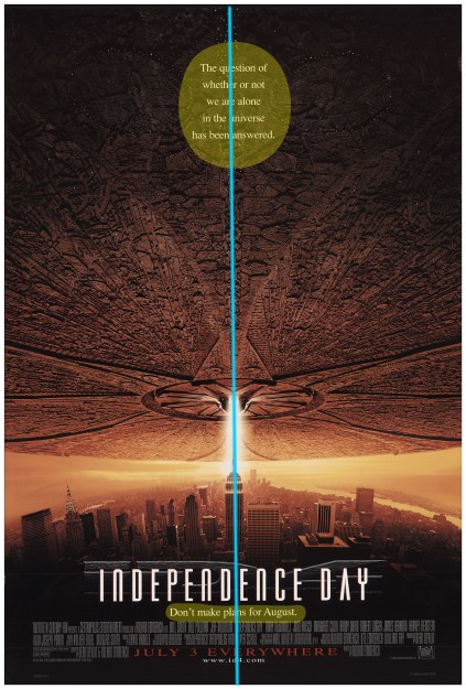
Another great thing about this image is the placement of the font up top.
Here you can see that the use of center alignment is justified, because it falls on the line created by the image. The image draws your eyes up from the title, to the text and the top and back again, sealing the most important points of the advertisement. Overall, this is a very successful and clear design that I love very much, a design that gets its point across in a concise and stunning manner.
