
The hardest part of this project was coming up with a simple design that I felt like represented me. I went through a lot of ideas, and many sketch phases before settling on the ideas you see in the sketches below.
As you can see, the final product ended up looking a lot like the sketch in the top left, though it went through a few minor adjustments.
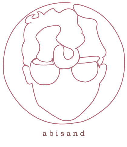
The final design draws on my most recognizable traits; my glasses and my hair, and I feel like it looks a lot like me. The username I use in most of my works is seen below, in a clean font in a matching color. I used this maroon shade because I really liked it and I think it’s rather neutral without being grey or brown.
I also went and created a business card for myself, continuing to use that desaturated maroon color as well as white. I contrasted the softness of my logo with the graphic sharp lines you see on both sides of the card. I also used the same font in the logo for the information on the back side.
Overall, I’m very happy with how this turned out and can’t wait to use it professionally.
