

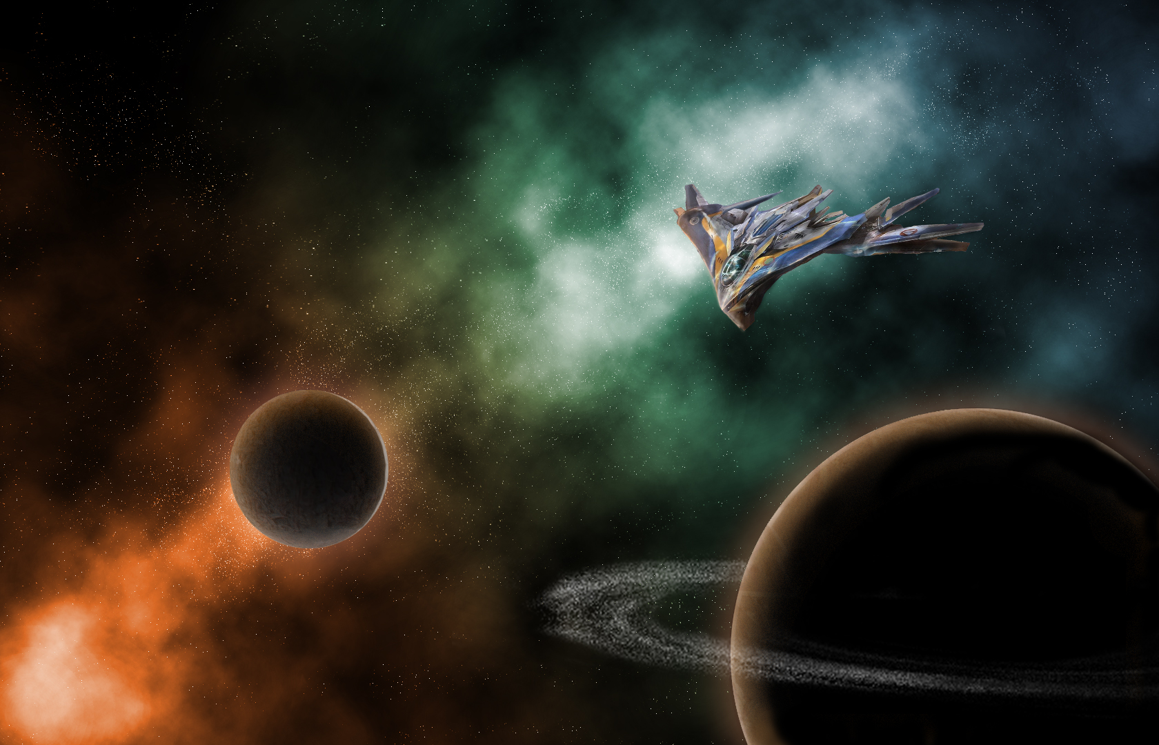
This is an illustration made using Adobe Photoshop. All the parts of this image are my original work except for the Milano illustration. This image (seen below) can be found at https://www.pinterest.com/pin/364158319853406510/?lp=true

The nebula seen behind the planets and ship were created using overlay layers with a orange-blue-green gradient as the base. To make the scene feel like it belonged in a Guardians of the Galaxy movie, I looked at a lot of screencaps from the two movies, as well as a few from other Marvel movies. Looking through these references, I saw that a lot of the Guardians’ spacescapes used a lot of contrasting colors with a single color as a light source.
Here, my light comes from the orange part of my nebula, casting orange light onto both my planets and my ship. The orange glow on the ship is much less noticeable than the glow from the planets, which was created by editing the layer style. I applied both an outer and inner glow as well as an inner shadow to give the planet depth.
Both textures of the planets were sampled from this image of my siblings and I with my grandmother on a hike several years ago.

The textures sampled from this image were applied to circular selections as patterns and edited to look more like a planet’s surface.
My favorite part of this image to work on was the Milano. In order to make the photo feel like it belonged in the scene, I had to go and paint in most of the shadows and lighting effects. The original image had harsh light coming from the opposite direction, so after I cut the ship out of its image and put it in my own, I had to carefully redo the lighting without destroying the look of the ship itself.
After all that, and lots of little tweaks, I was done!

