Raster Graphics Contest Submission

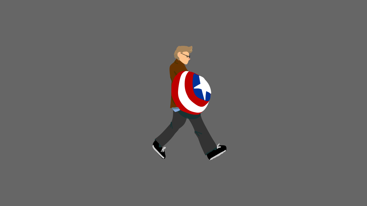
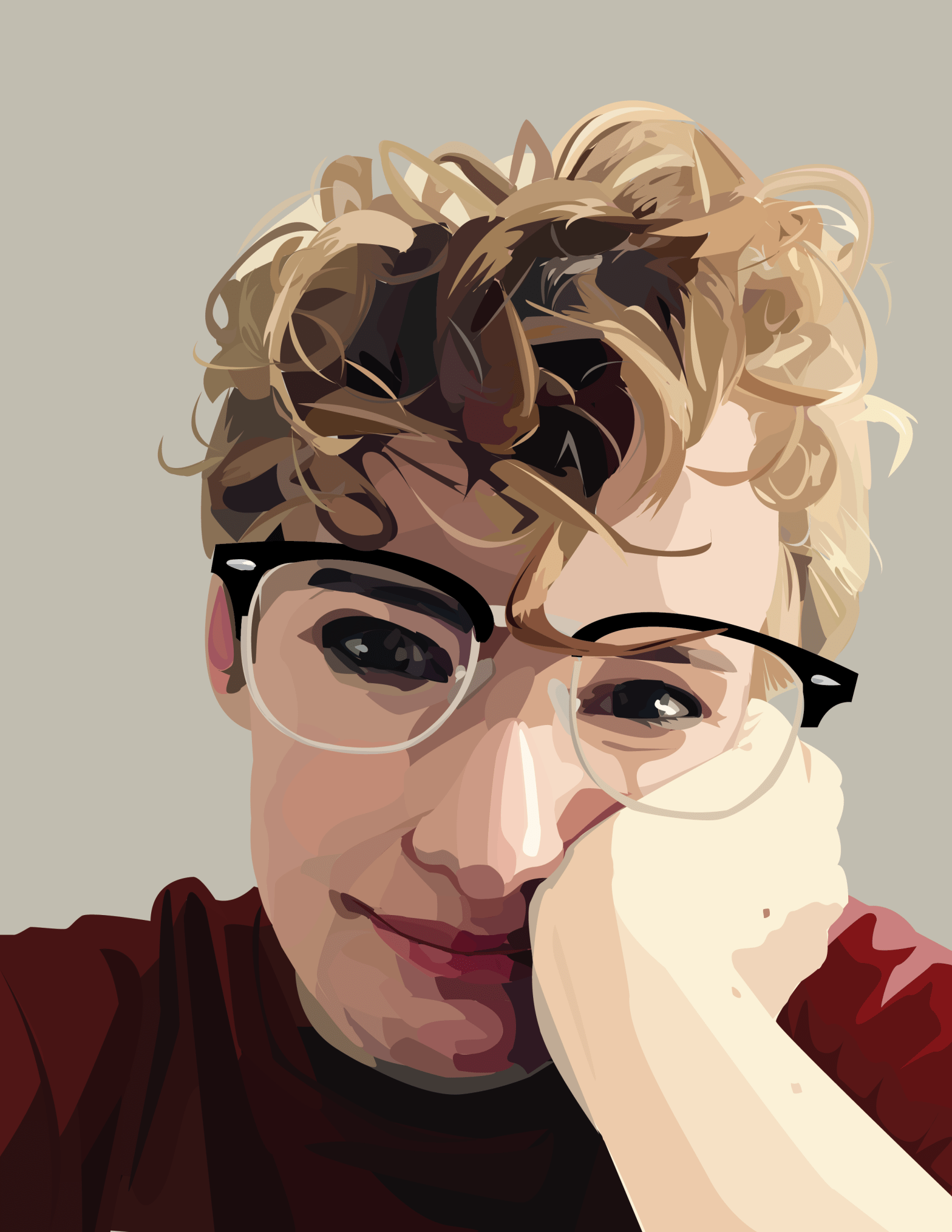
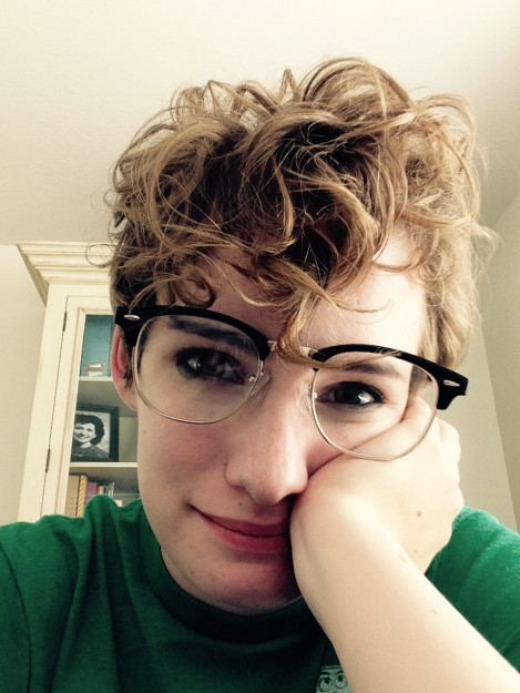
So this is the piece that I came up with for the contest submission. I do quite a bit of digital art anyway on my own time so I figured I’d do something similar to what I normally do, and something that really felt like my own work. This piece came about because I wanted to draw something that was maybe a little odd, but caught your eye.

Really, if you want an analysis, it’s about my (and others) fight against femininity. Take that as you will.

So basically, my routine for most of my digital art pieces starts with a sketch, then that sketch’s opacity is lowered and I do a more refined sketch on top, and then the process is repeated until I’m ready for lineart. I always do my lineart in a dark reddish color, cause I think it softens the whole look.

I then go in with color layers underneath the lineart, usually using a chunky charcoal brush or something like that cause I like the style of it. I do the skin tones first on their own layers, and I like to over blush the nose, cheeks, ears and knuckles. I then move onto the other pieces, using the layering to my advantage so I can color as efficiently as possible.


Motion Tweens


This is an extension of our last assignment, the walk cycle. Here, we used the motion tween function to create a background and a set for the character to run on. Each part of this set is on its own layer and moves at a different speed. The pavement moves a little faster than the sidewalk, and the shop fronts move the slowest.

I used the lamps up front to create a sense of depth, and I think it worked pretty well. I had a fun time designing the shop fronts, and the superhero symbols out front are of my favorite heroes (in order they are Captain America, Batman, the X-Men symbol, Red Hood and the Winter Soldier).

First Shot at Animation!


For this assignment, we had to animate based off of a video of ourselves. Fortunately, (for my creative brain, not my hands) I happened to be dressed as Captain America that day. Having the shield in there resulted in more work, but I think it looks cool!

Since I’m stationary, I had to make my feet slide back so I didn’t just nyooom off the frame. Which is not what I wanted. I am actually rather happy with the outcome here, despite the struggles along the way.

After a few sketch layers based off of my video I started color blocking. I started with the shield, my face and my jacket, adding my pants on a later under these so I could be lazy with the top of the shapes. After all the color blocking was finished (and after a lot of tweaking and polishing the movement), I moved on to shadows. During this time I also completed the shield. After all the shadows were done, I added the details on my shoes and my face.

After that, I was basically done!

There was a whole lot of trail and error, but we got there eventually.


Hobbit Movie Poster Remake!

With my Dungeons and Dragons party

Hobbit movie poster dnd remake

This was super fun to make, though we had a myriad of technical difficulties that left me scrabling to get it done, so though it isn’t the best I could have done, I think it’s alright considering the circumstances.

I know I got a number of odd looks from outsiders as I edited my friends to resemble their D&D characters, but the excitement that they showed for the project made it truly worth it.

So I originally photographed each of my friends and edited them in seperate photoshop documents. (And that was the bulk of the work). You can see each of them as their characters in the poster. I’m actually in the poster twice, as I took the spot of Gandalf (because I’m the Dungeon Master for this party), as well as the half-elf in the very back, who’s an NPC that I run that my party’s gotten very attatched to (his name is Flint).

Assembling this in InDesign was honestly a disaster, as I wan’t too familiar with the program, and I was scrambling to just get it done. However, each part of the poster (including my hand painted backgrounds and text), exitsts on its own layer, inside its own frame as this helps to isolate each piece and makes it easier to make smaller adjustments wihtout harming anything else in the piece. I would have done more with the text and layout, had I had more time, but I simply threw some filler text at the bottom and called it close enough.

(See original poster below for reference)

300844id1j_TheHobbit_TDOS_27x40_1Sheet.indd

Out of Bounds assignment

This image was created for an assignment in class using Adobe Photoshop. We used many masks and adjustment layers to achieve this outcome. The background of the initial train image was extracted, with the back half clipped to the white background. The back half went thought many adjustment layers to get the old black-and-white photo effect. The front half of the train was brushed out to create the gradient effect you see here. The final image had a few filters added to it, and then it was finished!

Spacescape Illustration

This is an illustration made using Adobe Photoshop. All the parts of this image are my original work except for the Milano illustration. This image (seen below) can be found at https://www.pinterest.com/pin/364158319853406510/?lp=true

credit to original artist, the concept of the Milano spaceship does not belong to me. I have no association with Marvel Studios

The nebula seen behind the planets and ship were created using overlay layers with a orange-blue-green gradient as the base. To make the scene feel like it belonged in a Guardians of the Galaxy movie, I looked at a lot of screencaps from the two movies, as well as a few from other Marvel movies. Looking through these references, I saw that a lot of the Guardians’ spacescapes used a lot of contrasting colors with a single color as a light source.

Light sources

Here, my light comes from the orange part of my nebula, casting orange light onto both my planets and my ship. The orange glow on the ship is much less noticeable than the glow from the planets, which was created by editing the layer style. I applied both an outer and inner glow as well as an inner shadow to give the planet depth.

Both textures of the planets were sampled from this image of my siblings and I with my grandmother on a hike several years ago.

The textures sampled from this image were applied to circular selections as patterns and edited to look more like a planet’s surface.

My favorite part of this image to work on was the Milano. In order to make the photo feel like it belonged in the scene, I had to go and paint in most of the shadows and lighting effects. The original image had harsh light coming from the opposite direction, so after I cut the ship out of its image and put it in my own, I had to carefully redo the lighting without destroying the look of the ship itself.

After all that, and lots of little tweaks, I was done!

Photography Analyses

Here we demonstrate the use of different photography elements and their effectiveness in art.

Depth of Field

‘Water Bender’ Photo by Kyle Rae Creative
My photo, taken at school

Using depth of field, the contrast of clear to blurry highlights the subject. In the first example, the subject’s face and everything behind her is blurred out, highlighting the water in front of her. In my photo, everything behind the flag is blurred, highlighting the flag itself. This is a useful effect for eliminating distractions in your image.

Leading Lines

Sunset in Tiraspol by Giuseppe Milo
My photo, taken at school

Both of these photos demonstrate the use of leading lines to draw your eyes to the subject. In the first example, we see the lines in the sidewalk taking us ahead of the subject, to give the illusion of motion. In the picture I took, both the lights and the carpet borders draw your eyes down the hall. This helps the viewer look where you want them to.

Rule of Thirds

Photo by Mason Morris
My photo, taken at school

The rule of thirds is one of the easiest photography elements to utilize. You can see in the sunset photograph, the ships fall in the leftmost third, and the color transitions in the sunset itself fall generally on the horizontal lines. There are several other parts of this image that fall on or near the third lines. In my own image, it’s not nearly as complex, simply the motorcycle falls on the right lower third marking. Use of this rule makes your photographs much more appealing.

Self Portrait

Using Adobe’s Illustrator, I created the image on the right using the image on the left as a reference. The original image was on a layer below all the other pieces, which allowed me to draw directly on top of it using the pen tool, and only the pen tool. The image is made up of a bunch of tiny little shapes. The most difficult portion by far was my hair. I spent a lot of time creating the tiny, jagged highlights and shadows, then filled in all the little holes with base values. The rest of the image came together through a lot of layering and fiddling with colors and shapes. As you can see, I changed the color of my shirt to maroon, which is my favorite color. I did this by drawing in my shirt in its original green color, creating all the shadows and the like. I then went into the color menu for each shape and changed the base color without changing the value, which allowed me to keep all the shadows looking right while still changing the color completely.

ID4 Poster Analysis

This is the original theatrical release poster for the movie ‘Independence Day’ also known as ID4. (IMDb link here.) I personally truly love this movie, and I love this poster even more. This poster was released in 1996 for the original showings of the movie.  

One of the best things about this poster, besides the enthralling image, is its use typography. Both the phrases and the fonts used really add to the design in a meaningful way.  

Here we can see the use of a oldstyle font, identified by its slanted serifs and variation in line weight. Serifs are the little marks at the ends of each letter, you can see them in the graphic below. 

I love oldstyle fonts, and this one here works well because of its simplicity against the complex picture and the contrast it has to the title font, which is a bold and stylistic sans serif. Both the thickness of the font and the existence of serifs make these fonts contrasting.  

Another great thing about this image is the placement of the font up top.  

Here you can see that the use of center alignment is justified, because it falls on the line created by the image. The image draws your eyes up from the title, to the text and the top and back again, sealing the most important points of the advertisement. Overall, this is a very successful and clear design that I love very much, a design that gets its point across in a concise and stunning manner.  

Design a site like this with WordPress.com
Get started